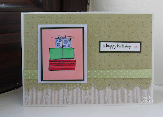
Here are a couple of cards I made at a recent online Stampin Up day. It was great fun and went smoothly due to the efforts of the Organiser Extraordinaire, Elvie.
We all had the same images and instructions for this layout. These were 2 lovely images to colour - I tried for a gold-coloured effect for the vase but I'm not sure if it worked.
This one was a very quick card using a SU image coloured with both Promarkers and Copics.
**************************************************************************
The lovely Rainbow asked about the best paper to use for your Copics & Promarkers. I think the choice of paper is down to preference, but results are better with very smooth paper that doesn't cause the ink to feather much. I use Bristol Board (available from artifolk, CraftsULove, Glitterpot,) and I've also used Stampin Up's Whisper White (available from SU demonstrators). Both these are excellent and I can definitely recommend them. They are a good bright white, a perfect weight for matting onto your cards, and best of all you can colour well on them as they only feather if you lay down a lot of colour. I've heard people recommend Rymans and Staples laser paper, approx 160gsm, but I've not tried them as yet.
You can test a paper by drawing a small shape with your multi-liner on it, and colouring it in with one, then another, then another layer of colour. If the ink feathers too much for your liking, use that paper for something else and find a better one. I think the only paper you really shouldn't use is anything coated with clay - some papers are clay-coated but that will damage your pen tips apparently.
Copic do a bleedproof marker pad that you could try if you really can't stop your ink feathering. I haven't tried that one either, but it's a lighter-weight paper so you might find it a bit thin for crafting.
While we're talking basics, don't forget to get the right ink pad for stamping. You'll need an ink that won't smudge when you use your alcohol markers on it. I think most of us use Memento in Tuxedo Black, widely available in craft shops. Definitely do NOT use Stazon, it will smudge when you colour over it (to be honest, I can't see why anyone uses Stazon on paper anyway). If you are using Digi images, you'll need to test your printer ink to see if it budges when you apply colour. You could heat-set the ink with your heat tool to try and make the ink more fast, although I have to confess I haven't tried this because I don't want to risk discolouring my pen tips. I have resigned myself to not using digi images except donated ones that I have tested. At least that's one thing I won't be tempted to spend money on.....I need anything I can to save me from craft retail therapy!
Happy crafting!
Carole x


7 comments:
Lovely cards - they seem somehow to ring a bell by me....Hugs, Valerie
Hi Carole, Oh I love your blog, so pleased to have found it.....you asked about the colouring on my paper pieced elf....it was grey, but wow did it blend well on that linen look paper, very lucky I felt..lol....thanks for your lovely comment.x
Great tips and card examples. Thanks for sharing.
Hi Carole, lovely to see you. Thank you for finding my blog, I have now become a follower of yours.
You are right, one layer cards are very difficult sometimes, 3 went into the bin before I came up with that one :o)
Beautiful cards, especially the bloom one, I love that stamp set :o)
Jackie xx
Your cards are beautiful and thanks for all the helpful hints!!!! Thanks for visiting my blog and leaving such a sweet comment!!!
Hi Carole, thank you for popping by my blog, its lovely to come by and see you here too! Your cards are lovely, I do like your style! I will keep an eye on you now!
Best wishes, Sue x
Your SU cards are lovely, hope you dont mind as I have also put them on my blog.
I love your little place here and I will be popping in regularly.
Thanks for your comments, take care and have a lovely weekend
Tracey x
Post a Comment