
There are probably many ways to colour a face, but this method works well with stamps like the Magnolia range and simple characters, and is a good basic technique that you can adapt for more complex images when you're more practised. It lays down the different shades in sequence, fully blending each layer with the last each time.
All the pictures are clickable to get a bigger and better view.
All the pictures are clickable to get a bigger and better view.
You'll need 3 skin tone colours, one very pale for highlight areas, one a little darker as your main skin tone, and one a little darker still as a shadow. You'll also need a pink or yellow-red pen as a cheek colour. In this example I've used E000 (highlight), E00 (midtone), E21 (shader) and R20 (cheeks).
These are the shades I'm using:

I use my palest shade (E000) and go over most of the face; I don't go all the way up to the outer line as a way of reducing the likelihood of the ink feathering:
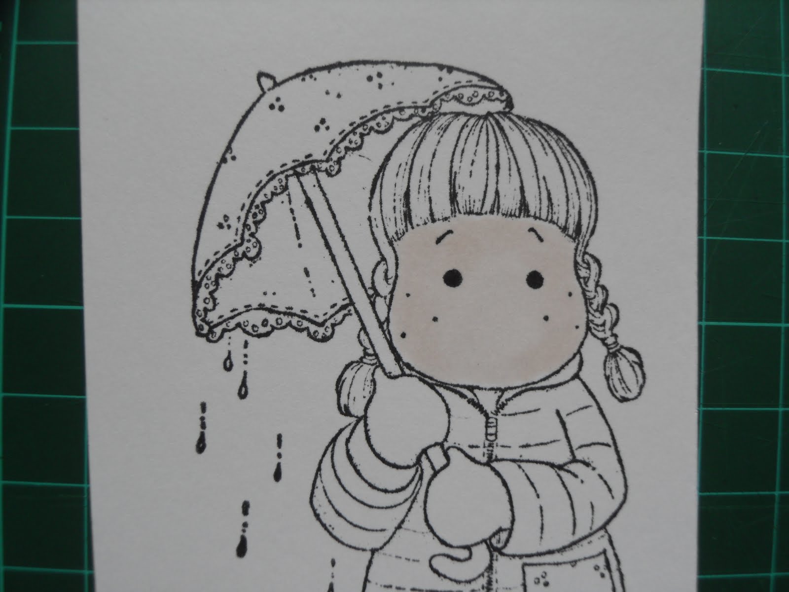
I take my midtone (E00) and use it over the 2 sides of the face and the forehead:

Then I use my palest shade (E000) and go over the whole face again to blend in the second colour (again, I don't go right up to the black line):

Then with my darkest shade, the E21, I apply some shadows: under the fringe and down the sides of the face:

Next, I go over the face with the E00 and the E000 again to blend in each colour:

The next step is to add the cheek colour: I just dab the marker lightly over the cheek area while the E000/E00/E21 are still wet - this will cause the R20 to bleed into the wet ink and give a nice blurry edge and avoid that unnatural 'painted doll' look. I had to break for a minute to take this photo, which allowed my ink to dry too much and so you can see on the right hand side where the dabs of R20 didn't blur very well. Usually, I would have done this quick enough:

Then, I go back over the face with E00 and E000 again to blend in nicely, covering the same areas with these colours as I did before; this makes the cheek colour more subtle and disguises the harder lines of some of those dabs of R20:

I thought the image needed a bit more shading, so I went back and put in a little more E21 to darken the shaded areas a little, then finished up by a final layer of E000 which I took up to the edges of the face:

As you can see, this method is laying down a lot of colour so you are at risk of the ink feathering over the black lines, and this photo shows some of the skin colour has bled into the collar. The 2nd photo shows the ink being pushed back using the Blender pen.


This is the finished result - the feathering has been corrected, and I've used a white gel pen to put dots on the cheeks which draw the eye in and just finish the face off: 

This method makes the most of blending all the colours well. Tomorrow, I'll show a simplified version of this method which will reduce the risk of feathering.
Happy colouring!
Carole x
9 comments:
Thanks Carole, very helpful and the pictures show the different shades beautifully. I just need to match the pen colours with promarkers.
Butterfly x
Excellent Carole, no wonder your colour always looks so perfect and professional. Thanks for taking the time to do this and nice to see your photo on here too.
Sara Bee xx
Very clear instructions and pictures Carole. Just hope I can do them justice. Thanks for info.
Greenfingers
Thank you Carole, great idea as I am no good at this shading lark and great to see you finally as a blogger, lol xx
I love the blog, and definitely needed this lesson. One question, do you use the pens direct to paper or pick up the colour from a tile or whatever?
keep up the good work, no wonder your colouring is second to none. xx hugs elvie xx
Elvie, on faces I always use the markers direct to paper, colouring in small circles to get good coverage. When I do the cheeks, I just dab the point of the marker onto the paper. I don't imagine that picking up ink from a tile would give that much coverage on the paper, although it might be something to try for the cheeks, might be a nice subtle colour rather than rosy cheeks. Hmmmm, must experiment! lol. Carole x
Hi "ME", love this, I will need to refer to this a lot I think, although pastels and olis can be done in a similar manner, I was hoping to do some painting on cards for here this year but we will see how things go. Great work keep it up , I just need those pens etc now, and advice on best paper to use. love "HER" -rainbow 7 xxxxxxx
Thanks for clarifying that Cobbly. I have got the copics in skin tones, and promarkers otherwise. I like the promarkers best as I am heavy handed and the softer tips of the copics will probably get damaged with me, also I don't have the same control as they are 'floppy'.
will have a go at Tilda's face tomorrow in natural light. hugs elvie xx
Thanks Carole, going to give this technique a go - lovely precise, clear and easy to follow instructions. Well done sweetie.
xxx
Post a Comment