Monday, 29 November 2010

Putting a coloured aura round your character


Tilda with an aura
Hi all, hope you are all managing to keep warm and cosy in this snowy weather.  It's lovely to see the white stuff on the ground, but the shivering I don't like so much!

Teresa from Docrafts asked me how I did the glow around Tilda in my recent card for Fluffles Tilda challenge/Copic Creations challenge.  It's really easy to do, and is a step up from the grey or blue shadow that we all put around our characters.

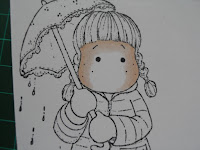
You'll need your blender pen and your chosen shade for the coloured glow.  I find the paler shades easier to blend out: in the Tilda challenge card, I used YR000, and in this first example I used R00. 

 
Basically, I add some colour around my image, then use the blender pen to fade that colour away to nothing.  I work in small sections at a time (so that the ink doesn't get a chance to dry or else it won't blend out so well), starting at the lower-right or lower-left of the image, just above the ground Tilda is standing on, working up and over the image and down the other side, stopping when I get to ground level.  If you start at the top, you'll get a 'join' in the ink where you began as that ink will have dried.


Blending out the R00

The finished image
Another way of achieving this look, but without the fiddliness of colouring around all the nooks and crannies of the outline, is to colour the glow onto plain white paper, then colour up your stamped image, cut it out and stick onto your coloured glow background. 

You don't have to do a whole aura glow, you can simply put in a fuzzy version of a shadow round your image, by just adding your grey shadow as usual, then using your blender to fade it out to nothing.  This gives a nice subtle edge to your shadow around your character.  Again, work in small sections at a time so that the shadow doesn't dry, or else you won't be able to blend it out very well.
B63 blended out as a shadow
B63 used to make an aura
This does use a fair bit of blender ink, so make sure your pen is full or have a spare marker handy.  I ran out of ink AGAIN during the colouring of the first example, hence my tip in my last post.

Have a go, and leave me a comment or a link to your coloured image or card, I'd love to see your results.

Happy colouring!
Carole x

Friday, 26 November 2010

Tip of the day

Hi all, just thought I'd share with anyone who's interested a little something I discovered whilst colouring an image recently.  I was using a  pale shade and fading it out to nothing using my blender pen.  About half way through the blender pen ran dry!  Disaster loomed cos you know you can't let your ink dry and resume the next day or after you've refilled because you can see the join.  Luckily, the chisel end of the pen still had some juice in it, so I was able to complete my project, but the chisel tip wouldn't have been too chunky for some work, so what then?  It made me realise that if it's a colour you use in every project and rely on, like the blender pen or your favourite skin colour, then it's a good idea to have 2 of those markers so that if you do run dry you can go seamlessly to your other marker. 

I have now got myself a nice new Sketch blender as well as my Ciao, plus a bottle of Various Ink to refill, so I can at least sleep at night now. 

Happy colouring!
Carole x

Monday, 22 November 2010

Tilda Challenge / Copic Creations Challenge - Paper-Piecing and shading

Hi all, hope everyone had a good weekend.  Mine was a very crafty one, managed to find my mojo after a bit of a dry spell and started and finished 3 cards!  It meant I was up till 3am 2 nights running, but great to get stuck into something creative again.


This is one of my makes......Fluffles is doing the Tilda challenge on Docrafts this week and she chose paper-piecing as the theme.  Well, this is one of my favourite techniques, not least because it gets me out of colouring what for me is the most difficult part of the image.  The challenge over on Copic Creations is also for paper-piecing, with the addition of shading on the cut paper. 


I adore this Tilda image, but it's not the easiest to paper-piece, as I found out.  The coat and gloves are cut from the pale cream backing paper (there's big hole in the middle under the mat where I stamped the coat for cutting out), and I used W1, W3 and W5 copics to add shading to the clothes.  Shading onto patterned paper was very much a new thing to me, and I fiddled around with it so much that you can't really see the pattern on the paper any more.  Nevermind, it was fun to make and I'm definitely going to try this again. Hope you like it.


Enjoy the rest of your Monday.

Carole x

Saturday, 20 November 2010

A Welsh Christmas card

Hi all, hope you're having a good weekend. The weather has taken a turn for the foggy and gloomy, so it's a great day for staying in crafting, right? I am hoping to crack on with a challenge card today; well, that's the plan but we shall see if I get round to it.

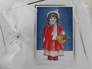
This is a card I am entering in the Totally Papercrafts Challenge; this week's challenge is Snow & Snowflakes, and as you can see I've got both in this card.  It's one of the very few Christmas cards I've actually made so far, I know I ought to get a move on!  The sentiment on this card is Welsh for 'Christmas Greetings' (I've only just found a shop that sells sentiment stamps and sentiment banners in Welsh, Crafter's Cove in LLandudno).

This is my very first blog challenge entry, so fingers crossed I can do it right!  Anyway, hope you like the card:


Carole x

Monday, 15 November 2010

A couple of Stampin Up cards, & a bit of basics

Hi all.


Here are a couple of cards I made at a recent online Stampin Up day.  It was great fun and went smoothly due to the efforts of the Organiser Extraordinaire, Elvie.


We all had the same images and instructions for this layout.  These were 2 lovely images to colour - I tried for a gold-coloured effect for the vase but I'm not sure if it worked. 


This one was a very quick card using a SU image coloured with both Promarkers and Copics.


**************************************************************************


The lovely Rainbow asked about the best paper to use for your Copics & Promarkers.  I think the choice of paper is down to preference, but results are better with very smooth paper that doesn't cause the ink to feather much.  I use Bristol Board (available from artifolk, CraftsULove, Glitterpot,) and I've also used Stampin Up's Whisper White (available from SU demonstrators).  Both these are excellent and I can definitely recommend them.  They are a good bright white, a perfect weight for matting onto your cards, and best of all you can colour well on them as they only feather if you lay down a lot of colour.  I've heard people recommend Rymans and Staples laser paper, approx 160gsm, but I've not tried them as yet.


You can test a paper by drawing a small shape with your multi-liner on it, and colouring it in with one, then another, then another layer of colour.  If the ink feathers too much for your liking, use that paper for something else and find a better one.  I think the only paper you really shouldn't use is anything coated with clay - some papers are clay-coated but that will damage your pen tips apparently. 


Copic do a bleedproof marker pad that you could try if you really can't stop your ink feathering.  I haven't tried that one either, but it's a lighter-weight paper so you might find it a bit thin for crafting. 


While we're talking basics, don't forget to get the right ink pad for stamping.  You'll need an ink that won't smudge when you use your alcohol markers on it.  I think most of us use Memento in Tuxedo Black, widely available in craft shops.  Definitely do NOT use Stazon, it will smudge when you colour over it (to be honest, I can't see why anyone uses Stazon on paper anyway). If you are using Digi images, you'll need to test your printer ink to see if it budges when you apply colour. You could heat-set the ink with your heat tool to try and make the ink more fast, although I have to confess I haven't tried this because I don't want to risk discolouring my pen tips.  I have resigned myself to not using digi images except donated ones that I have tested.  At least that's one thing I won't be tempted to spend money on.....I need anything I can to save me from craft retail therapy!


Happy crafting!


Carole x

Wednesday, 10 November 2010

Colouring faces - a simplified version

Afternoon all.

As promised, here is a second post about colouring faces, this time a more simplified version. If you find that the fully-blended method shown here makes your ink bleed a lot, or if your paper isn't the best, then this method might suit you better. This quicker method will cut out some of the blending steps, which will reduce the likelihood of your ink feathering over the line. We're using the same shades as before - E000, E00, E21 and R20. Rather than starting with your lightest shade and getting darker with each marker, we're going to apply the shading first and work up to the lightest colours. Usually, I wouldn't recommend using your darkest colour first as it is harder to blend a lighter colour into it, but with faces you are using such pale shades anyway that it won't make a difference.

Click on the photos for a bigger clearer view.

So, take your darkest colour (in this case E21) and apply to the areas where you want a bit of shadow - under the fringe and down the sides of the face:


Then take your midtone (here I'm using E00), and colour over the shadows, taking the colour further into the face, using small circles to get an even coverage:


Next comes your palest shade, your highlight (in this case, E000) - go over the entire face, again colouring in small circles to get even coverage and to blend well with your previous shades:


While this ink is still wet, take your cheek colour (I'm using R20) and just lightly dab the point of the marker into the wet ink so that it feathers out a little:


Then, go back with your E00 and your E000 over the entire face but especially over the cheeks to feather that R20 out a little more to get a nice rosy glow rather than a hard line of pink colour (alternatively, you can just use the E000):


Finally, if you like, add 2 or 3 dots with a white gel pen on the cheeks to draw the eye and give that finished look:


So, why do the fully-blended method rather than this quicker one? Well, if you look at the last photo, which shows on the left the fully-blended Tilda face and on the right this quicker colouring method, you might see the difference. I think the fully-blended face has more depth due to the extra layers of colour I laid down. It comes down to preference - I like lots of colour and richer colours, even in skin tones, but I'd still use the quicker method if I wanted a paler complexion to my little character. You might feel differently and prefer a lighter coverage. So, I hope you find one of these methods useful in your colouring.

Happy colouring!

Carole x

Tuesday, 9 November 2010

Colouring faces

This post is showing one method of colouring faces on character stamps. It's worth learning how to do faces as they are the first part of a finished image that your eye is drawn to, and your attention is held here more than anywhere else, which means that you can get away with less than perfect colouring elsewhere if your character's face looks good.

There are probably many ways to colour a face, but this method works well with stamps like the Magnolia range and simple characters, and is a good basic technique that you can adapt for more complex images when you're more practised. It lays down the different shades in sequence, fully blending each layer with the last each time.

All the pictures are clickable to get a bigger and better view.

You'll need 3 skin tone colours, one very pale for highlight areas, one a little darker as your main skin tone, and one a little darker still as a shadow. You'll also need a pink or yellow-red pen as a cheek colour. In this example I've used E000 (highlight), E00 (midtone), E21 (shader) and R20 (cheeks).

These are the shades I'm using:
I use my palest shade (E000) and go over most of the face; I don't go all the way up to the outer line as a way of reducing the likelihood of the ink feathering:

I take my midtone (E00) and use it over the 2 sides of the face and the forehead:

Then I use my palest shade (E000) and go over the whole face again to blend in the second colour (again, I don't go right up to the black line):

Then with my darkest shade, the E21, I apply some shadows: under the fringe and down the sides of the face:

Next, I go over the face with the E00 and the E000 again to blend in each colour:

The next step is to add the cheek colour: I just dab the marker lightly over the cheek area while the E000/E00/E21 are still wet - this will cause the R20 to bleed into the wet ink and give a nice blurry edge and avoid that unnatural 'painted doll' look. I had to break for a minute to take this photo, which allowed my ink to dry too much and so you can see on the right hand side where the dabs of R20 didn't blur very well. Usually, I would have done this quick enough:

Then, I go back over the face with E00 and E000 again to blend in nicely, covering the same areas with these colours as I did before; this makes the cheek colour more subtle and disguises the harder lines of some of those dabs of R20:


I thought the image needed a bit more shading, so I went back and put in a little more E21 to darken the shaded areas a little, then finished up by a final layer of E000 which I took up to the edges of the face:


As you can see, this method is laying down a lot of colour so you are at risk of the ink feathering over the black lines, and this photo shows some of the skin colour has bled into the collar. The 2nd photo shows the ink being pushed back using the Blender pen.

This is the finished result - the feathering has been corrected, and I've used a white gel pen to put dots on the cheeks which draw the eye in and just finish the face off:

This method makes the most of blending all the colours well. Tomorrow, I'll show a simplified version of this method which will reduce the risk of feathering.
Happy colouring!
Carole x